 In just three weeks, Silver has gone from the brink of collapse to being on the verge of a price breakout. But this sort of price action isn’t uncommon from assets in a longer-term corrective phase; in short, bulls get worn down by the short relief rallies that return to the grinding stair-step lower. That said, the price action in the Silver ETF (SLV) looks promising, provided follow through confirmation arrives shortly.
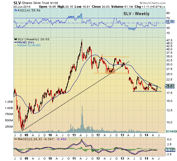
Below are a series of daily and weekly charts highlighting the triangle pattern in the Silver ETF. Although triangle patterns can break either way, this has the appearance of a wide descending triangle which tends to be bearish; hence the reason to wait for upside follow through confirmation.
iShares Silver ETF (SLV) Weekly Chart
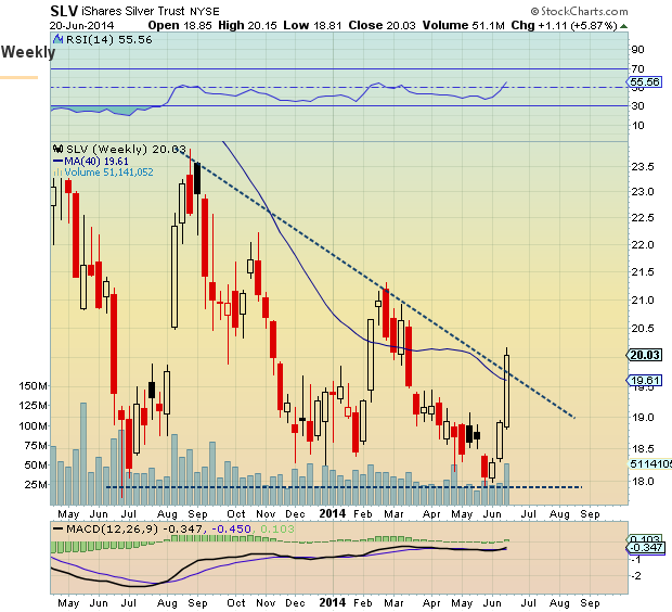
Looking more closely at the weekly chart (see “Zoom” chart below), we can see how strong this week was for SLV. The Silver ETF closed the week above the downtrend line. Should we see follow through price action, targets would point to 23.84 (the August 2013 high), then the open gap up to lateral resistance at 25.28. But patience here is key, as the Silver ETF isn’t quite out of the woods.
iShares Silver ETF (SLV) “Zoom” Chart
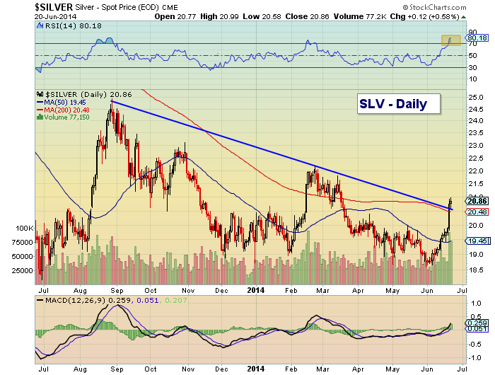
Looking at the daily chart, two things stand out:
- The RSI is above 80. That is a sign of strength, but also a sign of being overbought. Fortunately, the weekly chart is registering a more constructive 55. A few days of consolidation may be in order to work off this move. But too much backing and filling will make the SLV vulnerable again.
- Price has risen above the 200-day moving average… again. Note that SLV was unable to hold above the 200-day ma in March. And considering its proximity to the downtrend line, , it’s importance cannot be overlooked this time around.
iShares Silver ETF (SLV) Daily Chart
Thanks for reading.
No position in any of the mentioned securities at the time of publication. Any opinions expressed herein are solely those of the author, and do not in any way represent the views or opinions of any other person or entity.

