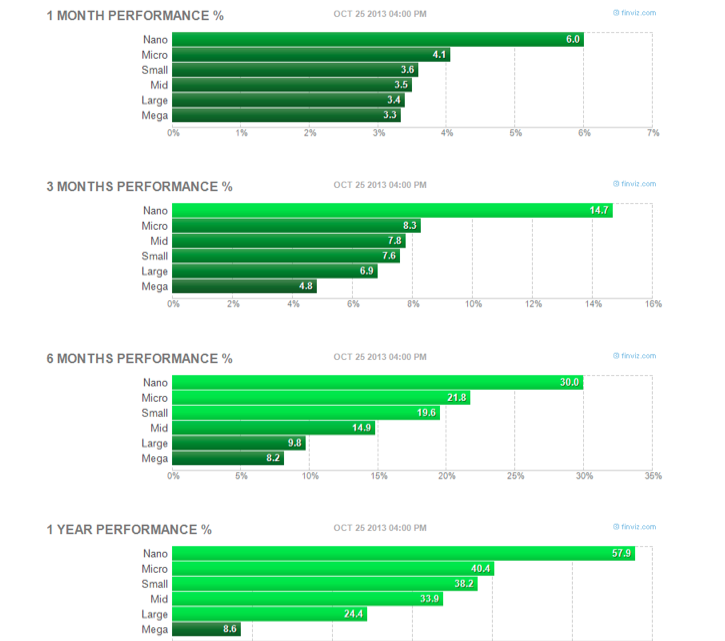
Since the November 2012 lows, relative strength in market capitalization has been dominated by a bottom-up regime in which the smallest companies have performed best and largest have lagged most. Courtesy of Finviz, here’s a multi-time frame lookback at market cap leadership over the last year:

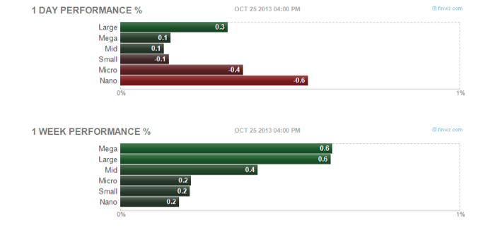
There’s a distinct trend unfolding here. That is, until last week:

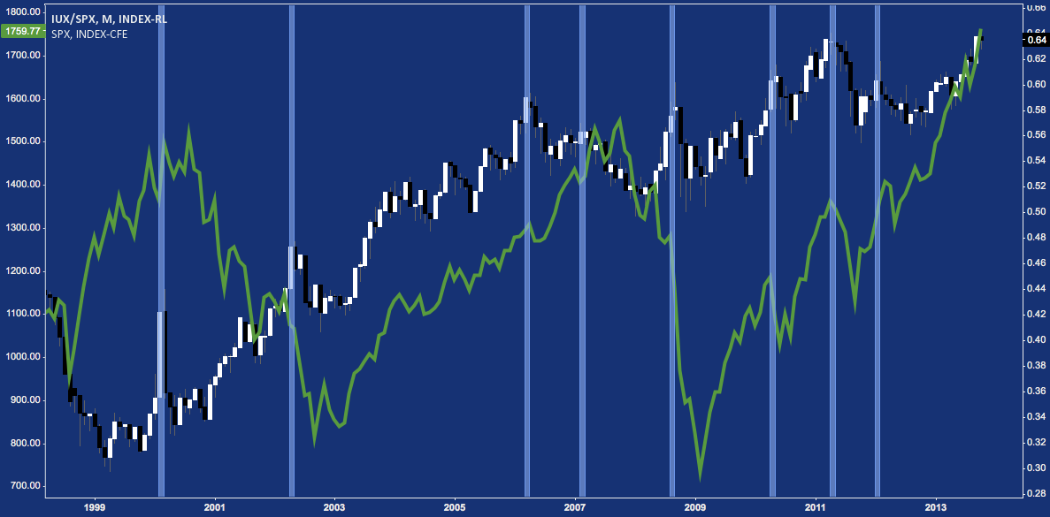
It’s too soon to tell if this is an ephemeral change in character or if the large(st) caps are assuming top-down leadership after lagging for so long. If small caps are indeed taking a back seat, though, it is worthwhile to consider the transition’s potential cyclical implications, apparent here:
Small Caps v. Large Caps (RUT v. SPX) – Monthly Chart: 1998-2013

What do you notice are often the ramifications for the market at large (green line above: S&P 500) historically when large caps begin to exhibit relative strength (occurs when above chart trends down)?
Twitter: @andrewunknown and @seeitmarket
Author holds net short exposure to Russell 2000 at time of publication.
Any opinions expressed herein are solely those of the author, and do not in any way represent the views or opinions of any other person or entity.


