 The first half of 2013 in foreign exchange for the G10 has been dominated by some very familiar macro narratives: a US Dollar pushed around by the Fed’s forward guidance and, later, talk of “tapering”; the Euro plagued by crisis, though the good news of OMT and declining peripheral yields seem to suggest a more optimistic view; and the Yen derided, debased and buried by the BOJ (though not intentionally, we’re reassured) in an implicit effort to support the aggressive economic reforms of being waged through Abenomics.
The net result? A resurgent Greenback, up over 4% through the end of June; but the road hasn’t exactly been a smooth one. With the first half of the year closing out, let’s examine a series of forex charts (check out the chart annotations on each for detail) showing the USD itself and its ups-and-downs to-date versus other G10 bloc currencies. If case these charts look peculiar: we’ll be looking at them through the lens of Ichimoku Kinko Hyo, a unique technical overlay that may seem unusual but provides an excellent view of support, resistance and price equilibrium.
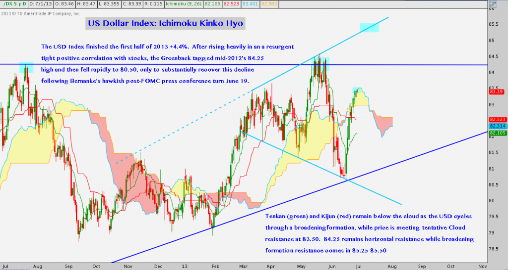
First the USD Dollar Index:
DX – Daily (click image to zoom)
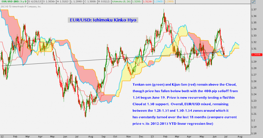
A quick note in case you’re unfamiliar: foreign exchange, or forex quotes are always given as a pair. This is because currencies are a) it takes two to “exchange”; and b) these currencies have no objective value but are always expressed as a floating ratio of value one to another. Therefore the Euro/Dollar (EUR/USD) ratio or “rate” is 1 Euro-to-1.3008 US Dollars, expressed simply as “1.3008”.
EUR/USD – Daily (click image to zoom)
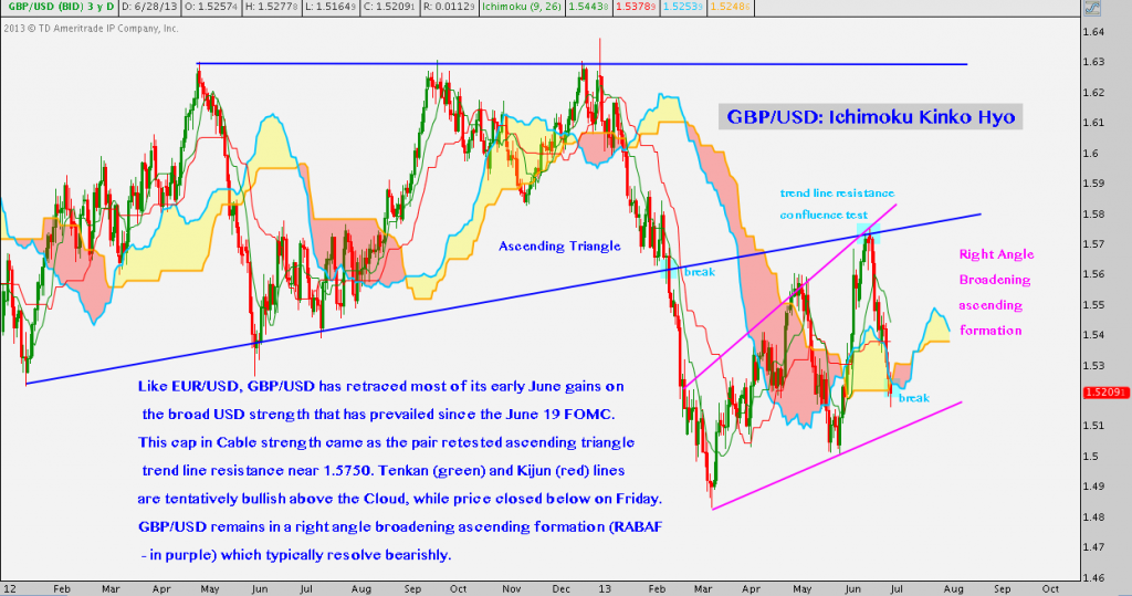
GBP/USD – Daily (click image to zoom)
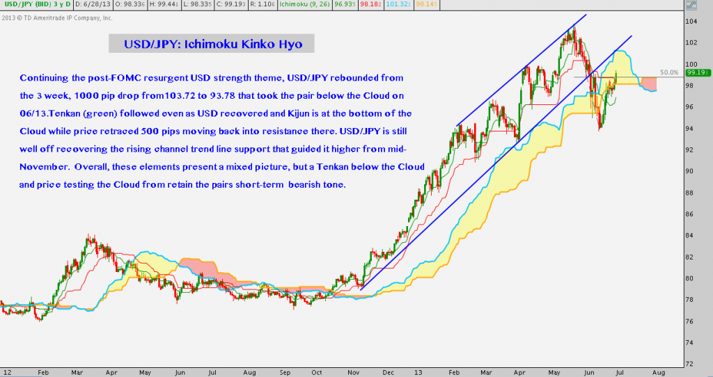
If you’re unclear on forex quotes, the next pair is distinct from the above. In the case of USD/JPY, the US Dollar (USD) is now the base currency, while the Yen (JPY) is the currency referenced when the quote is given.
USD/JPY – Daily (click image to zoom)
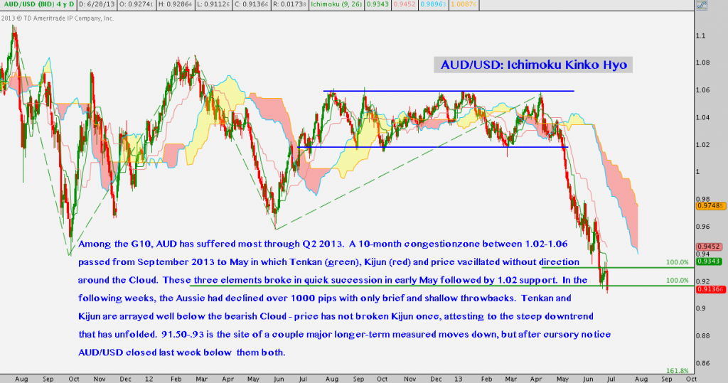
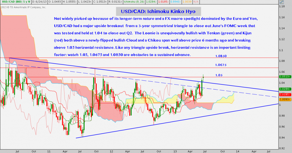
The Australian Dollar (AUD) and Canadian Dollar (CAD) are “Commdolls” or “Commodity Dollar currencies”, so-called because of their economies’ susceptibility to commodity prices: metals in the case of Australia (e.g. gold) and energy in the case of Canada (e.g. light sweet crude oil). In the AUD/USD (Aussie) and USD/CAD (Loonie) charts that follow, see if you note any divergence from the general trend patterns set above and any correlation between the state of these Commdolls and the commodities to which they’re inextricably tied.
AUD/USD – Daily (click image to zoom)
USD/CAD – Weekly (click image to zoom)
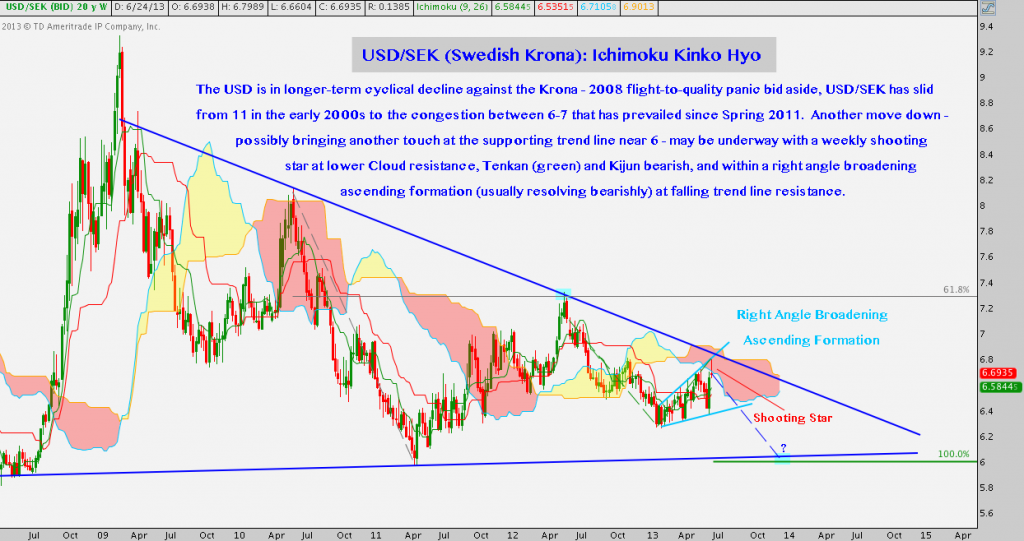
The triumph of King Dollar isn’t total, though. One exception to this trend of USD strength is weakness against the Swedish Krona:
USD/SEK – Weekly (click image to zoom)
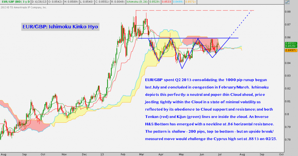
Bonus Chart: EUR/GBP – Daily (click image to zoom)
Twitter: @andrewunknown and @seeitmarket
Author holds no position in the securities or instruments mentioned at the time of publication.
Any opinions expressed herein are solely those of the author, and do not in any way represent the views or opinions of any other person or entity.

