A respected former colleague of mine absolutely loved to play devil’s advocate. Whatever investment thesis was posed, he would always take the other side of the argument.
Over time, I began to understand and respect this approach.
Sometimes his challenge would expose behavioral biases such as confirmation bias or the endowment effect, leading us to reconsider our outlook and positioning. Other times, it would simply confirm our original thesis but give us all confidence that we had considered other points of view.
In the era of social media echo chambers, it is way too easy to get sucked into a specific narrative and then find ourselves surrounded by confirming evidence. Unless you make a concerted effort to explore other points of view, you’ll remain the prisoner of your own narrative.
In that light, I thought I’d take a stab at a bearish case for US stocks. Please keep in mind I’m actually long-term bullish on the equity markets, and I feel that this secular bull will end much higher than current levels. However, I do get a sense that the market needs to go further in time (and most likely farther down in price) before we can declare the correction to be behind us.
Here are five pieces of evidence that support a bearish case for the US stock market.
1) A DEFINITE LACK OF BREAKOUTS
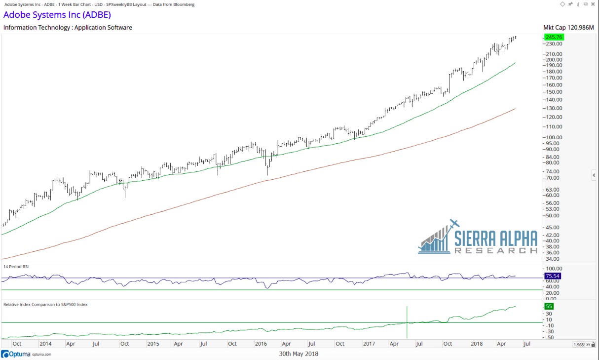
As the saying goes, “It’s a market of stocks, not a stock market.” The good news is that even with the market in an extended correction, there have been stocks breaking to new highs. Adobe Systems (ADBE) comes to mind as a stock that doesn’t seem to be aware of the market correction. To put another way, if you only looked at this chart, you would most likely not expect the market to be in a correction.
source: Optuma; Bloomberg
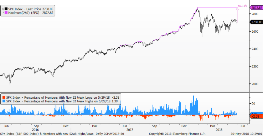
The bad news for the market is that the average stock does not look like Adobe. Very few stocks are at new 52-week highs, currently around 2-3%. On the other side, I’m also seeing 3-5% of stocks reaching new 52-week lows on recent market selloffs.
source: Bloomberg
Now while this first point may not be overwhelmingly negative, it certainly goes against the “everything’s fine and the markets are great” thesis I’ve seen floating around.
2) MANY STOCKS ARE BELOW THEIR 200-DAY MOVING AVERAGES
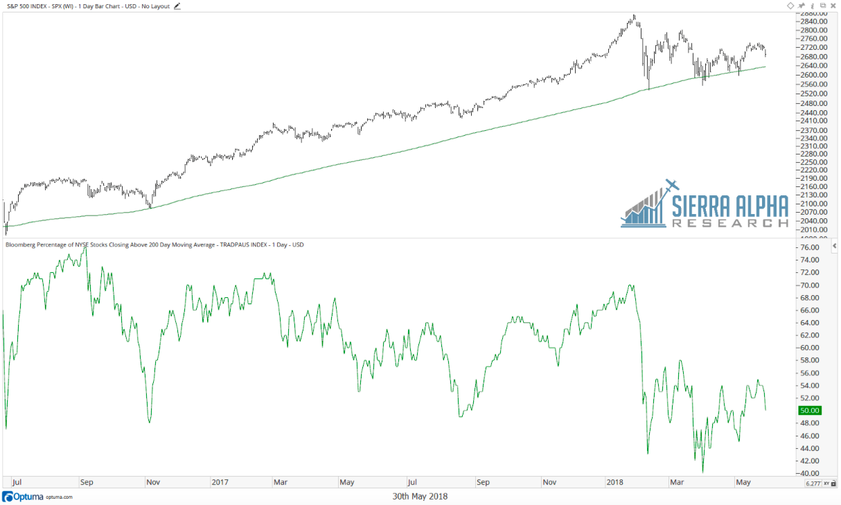
The SPX has successfully tested the 200-day moving average a number of times since the initial selloff in February. While the broad market index remains above this long-term smoothing mechanism, it’s worth noting that about half of NYSE stocks are below their 200-day moving averages.
source: Optuma; Bloomberg
As a matter of fact, when the SPX tested its 200-day moving average previously, as many as 60% of NYSE stocks were already below their 200-day. As much as we want to pay attention to the broad market, the charts of individual stocks may give us a clearer picture of underlying strength and weakness.
3) THE RSI FOR MANY STOCKS HAS ENTERED A BEARISH RANGE
Connie Brown changed my thinking on oscillators when I read her book in preparation for the Chartered Market Technician (CMT) exams. An indicator like RSI has a bullish range and a bearish range. In an uptrend, you expect higher RSI values, and the opposite in a downtrend.
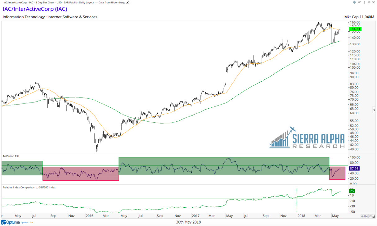
Stocks like IAC/Interactive Corp (IAC) became oversold (RSI < 30) as they sold off in February. What’s interesting here is that in a bull phase, the RSI will usually stay above 40. You can see the difference between bullish (green) and bearish (red) phases in the chart of IAC above.
While IAC becoming oversold is not a dramatically negative signal on its own (and the fact that it became oversold at its 200-day moving average suggested a tradable bounce), this could be the beginning of the RSI staying in the 20-60 range, which often coincides with bear markets.
4) VOLUME SUGGESTS DISTRIBUTION, NOT ACCUMULATION
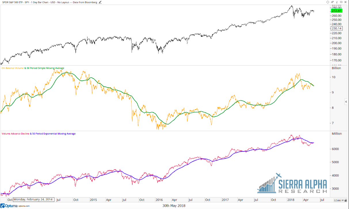
If we look at the volume trends over the last four months, there has been a clear transition from a period of accumulation to distribution.
source: Optuma; Bloomberg
Here we’re looking at On Balance Volume (Joe Granville’s method of aggregating up/down volume over time) as well as the Volume Advance Decline line (a simple cumulative measure of volume on up days vs. down days).
By smoothing out these volume indicators with a 50-day moving average, we can see how the volume has been trending lower since February. This would only happen due to a) heavier volume on down days vs. up days, b) more down days than up days, c) a small number of unusually strong down days, or d) some combination of the above. Any combination of the above has to be considered more bearish than bullish.
5) BANK STOCKS LOOK PRETTY MUCH TERRIBLE
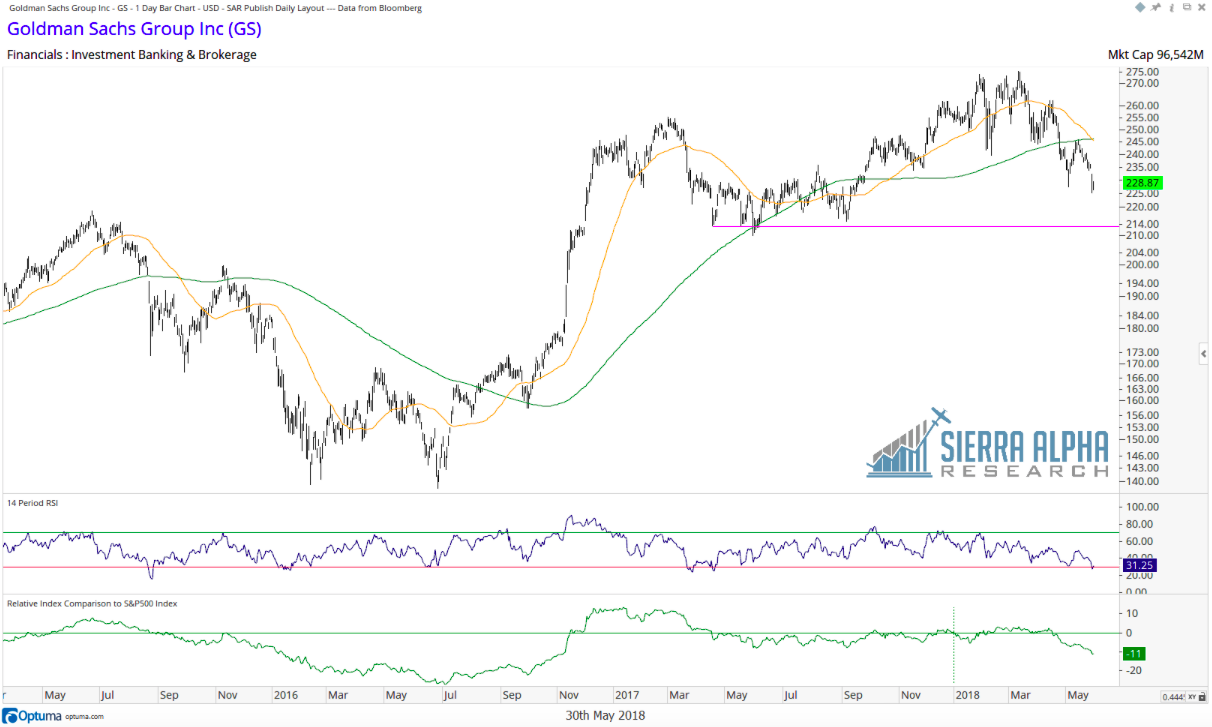
Legendary technical analyst Paul Montgomery once said, “The most bullish thing the market can do is go up.” The other side of that would be, “The most bearish thing the market can do is go down.”
source: Optuma; Bloomberg
Quite simply, it’s hard to be bullish when you see a stock like Goldman Sachs look like this. Lower highs and lower lows, a confirmed breakdown and retest of the 200-day moving average. Significantly underperforming.
There may be a scenario where the market rallies with bank stocks in a confirmed downtrend, but it hasn’t happened very often. 2015-2016 saw the market annoyingly sideways while GS under performed. While that isn’t the most negative scenario out there, it certainly isn’t a bullish one.
Regardless of your market outlook or portfolio positioning, I would encourage you to step out of the echo chamber and make a deliberate effort to argue for the other side. Literally jot down your bullet points and think through the arguments. Most importantly, make sure that if your alternate scenario ends up actually playing out, you have a good backup plan!
Thanks for reading!
Twitter: @DKellerCMT
Any opinions expressed herein are solely those of the author, and do not in any way represent the views or opinions of any other person or entity.

