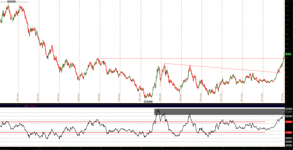
The U.S. Dollar Index has been on a tear since last year, rising nearly 21 percent since the rally began. I recall speaking to many technicians and market participants that were fighting the strength just as the dollar rally was getting started back in the 3re quarter of 2014. I personally think we may be in the beginning stages of a larger dollar rally but some of the indicators and charts that I’m following are depicting a possible correction/resting period for this monster move.
The first chart is the spread between current price and the 50 week moving average. As you can see, this spread is reaching a pretty extreme level, likely limiting near-term upside. (click charts to enlarge)
US Dollar Index 15 Year Chart – Is The Dollar Rally Nearing Exhaustion?
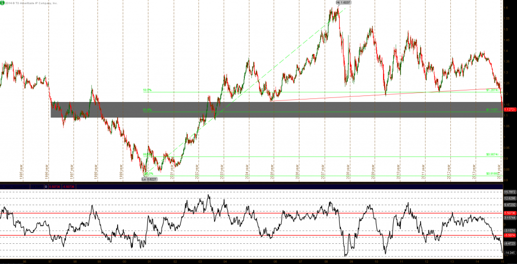
Also looking at the EUR/USD, the chart shows a similar picture. The Euro recently reached some very oversold levels (check out the Moving Average spread indicator).
EURUSD Chart
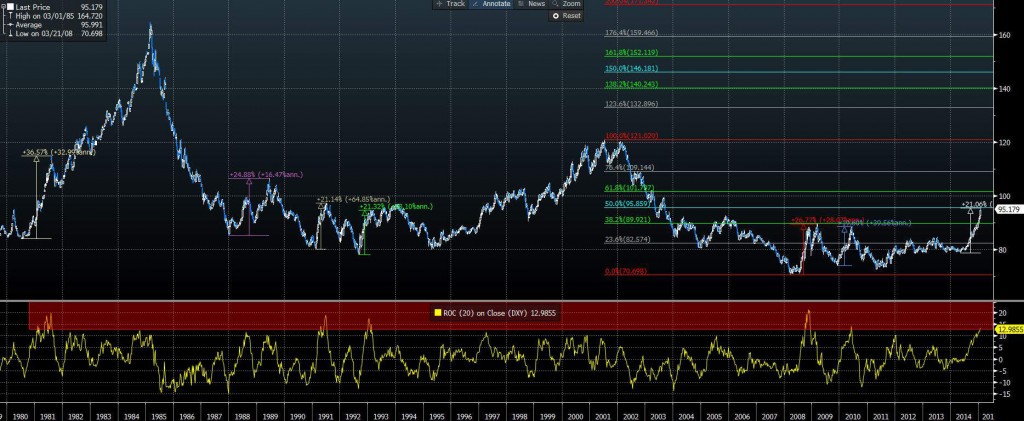
Lastly, let’s return to the U.S. Dollar Index again. When looking at the chart below, it’s interesting to see how many dollar rallies stalled out in the 20-30% range. Also, the 20 week ROC (Rate of Change) is beginning to look extended. The chart below dates back to the 1980’s for greater perspective and reference.
US Dollar Chart 1980-2015
It’s safe to say that the dollar rally is looking a little extended. It may be time for a rest after this massive run up.
Thanks and trade safe.
The material provided is for informational and educational purposes only and should not be construed as investment advice. All opinions expressed by the author on this site are subject to change without notice and do not constitute legal, tax or investment advice.
Twitter: @stockpickexpert
No position in any of the securities mentioned at the time of publication. Any opinions expressed herein are solely those of the author, and do not in any way represent the views or opinions of any other person or entity.

