This post was written with Craig Basinger of Richardson GMP.
The Market Multiple
This is generally understood to be the price of the equity index divided by the aggregate earnings of the index constituents.
The price is the easy part, it is the index level, while the earnings are the hard part. Often it is the trailing 12 months of earnings for each company, yet this is somewhat backward looking. The companies already earned and reported that money, so buying today gives no call or right of ownership of these past results. Forward consensus earnings are better in our view. Although you then must accept these are best guess forecasts. Forecasts change over time and in the end reality does not always equal the forecast (In case you haven’t noticed!).
ALSO READ: Are ETFs Driving The Market’s Herding Mentality?
There are also some extremes such as the Shiller PE ratio that uses inflationary adjusted earnings over the past 10 years. The goal is to normalize earnings over an entire cycle. However, if you agree that trailing 12-month earnings are backward looking, going back 10 years is even more so.
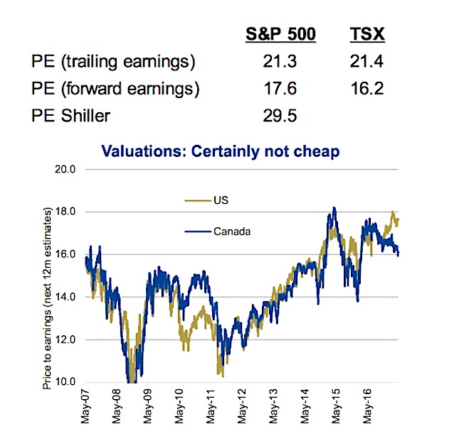
The table below contrasts different equity valuation approaches. A few other tricky aspects include negative earnings and how to weigh all earnings. Does a company losing $100 million offset a company earning $100 million? So from a market valuation perspective, the two companies together have no value? It doesn’t sound right, and when WorldCom booked massive losses years ago, it made the market multiple move materially higher as it depressed aggregate earnings for the whole index. Then how to weigh earnings? Most aggregate all the underlying earnings in the index. Yet, if you are considering buying the index, shouldn’t the company weights in the index drive their representation in the market multiple?
None of these factors negate or diminish the use of valuations, but one should understand some of the potential shortcomings and the math.
Today – 2017
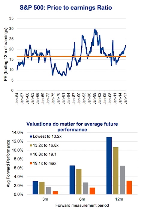
Yes, by just about every variation of the market’s price-to-earnings (PE) multiple, it is on the expensive side. The average PE based on trailing earnings for the S&P 500 (INDEXSP:.INX) dating back to the 1950s has been 16.5x and today it is 21.3x. With a shorter history, the PE ratios based on forward consensus earnings estimates is 16.2x for the TSX and 17.6x for the S&P 500.
Now the difference between the two PE ratios, from trailing to forward does highlight another big factor – growth. PE ratios are a point in time measurement and they do not incorporate earnings growth. If earnings are growing, it is understandable to have a somewhat elevated PE ratio. After all when two markets are trading at 15x, the one that is growing earnings is clearly the better choice.
Everyone loves a deal. Something that usually costs $100 is on sale for $75, brings an increased level of happiness to the purchaser. The same happens in the markets, and buying at a lower price-to-earnings ratio does appear to lead to better forward performance. For the S&P 500, we broke down valuations into quartiles and measured the average subsequent performance of the market.
Under each measurement period of 3, 6 and 12-months, lower valuations performed the best and the highest valuation quartile the worst.
As we have mentioned, you can hide a lot in average performance. We also considered how often the market is higher given different valuations quartiles (buckets). Looking out one year, the market was higher 77% of the time if valuations were below 13.2x. The market was higher only 58% of the time if valuations were over 19.1x, the most expensive quartile.
Investment Implications
Valuations do matter and provide some insight into future returns. Given current elevated valuations, return expectations should be muted somewhat. But it doesn’t mean sell the market as valuations can remain elevated for some time. For example, the S&P 500 was in the most expensive quartile this time last year and has since risen +19%. That being said, the market is now deeper into that most expensive quartile.
Valuations don’t signal market tops or bottoms, but they do provide some insight into future return expectations.
Thanks for reading. Charts are sourced to Bloomberg unless otherwise noted.
Twitter: @sobata416 @ConnectedWealth
Any opinions expressed herein are solely those of the authors, and do not in any way represent the views or opinions of any other person or entity.


