 After the financial crisis, it became clear to many investors that markets were far from being normally distributed. Tools like VaR and other risk management tools relying on a normal distribution should have been jettisoned from financial practice, or at least downgraded in importance. However, even after the financial crisis, firms continue to rely on normal distribution indicators. I think the primary reason they do is because of the number of different types of analysis that single assumption allows for. I would estimate that at least one third of most university finance textbooks contain material predicated on that single assumption [normal distribution] being true.
Siding with those that believe markets are not normally distributed, I decided to perform a study to find out just how far from being normal they really are. The results (posted in several charts below) were astounding. But first, let’s break down the parameters of the study.
In my analysis, I took daily return data from different asset classes beginning in January 1, 2000 through July 16, 2013. In each asset class, I looked at the following:
Equities
- S&P500 (SPX)
- Dow Jones (INDU)
Rates
- U.S. 10 year yield (USGG10YR)
- 6 month LIBOR (US0001M)
Commodities
- Gold (XAU)
- Silver (XAG)
- Crude/WTI (USCRWTIC)
Currencies
- USDJPY
- USDCAD
- USDAUD
- USDEUR
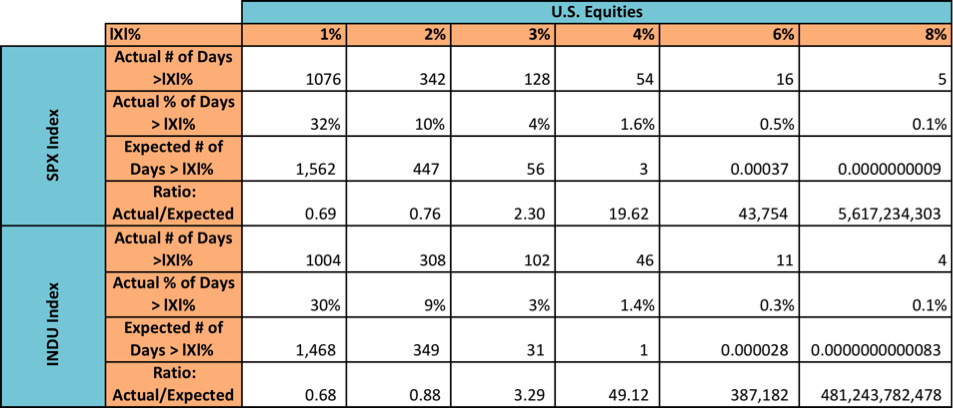
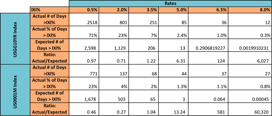
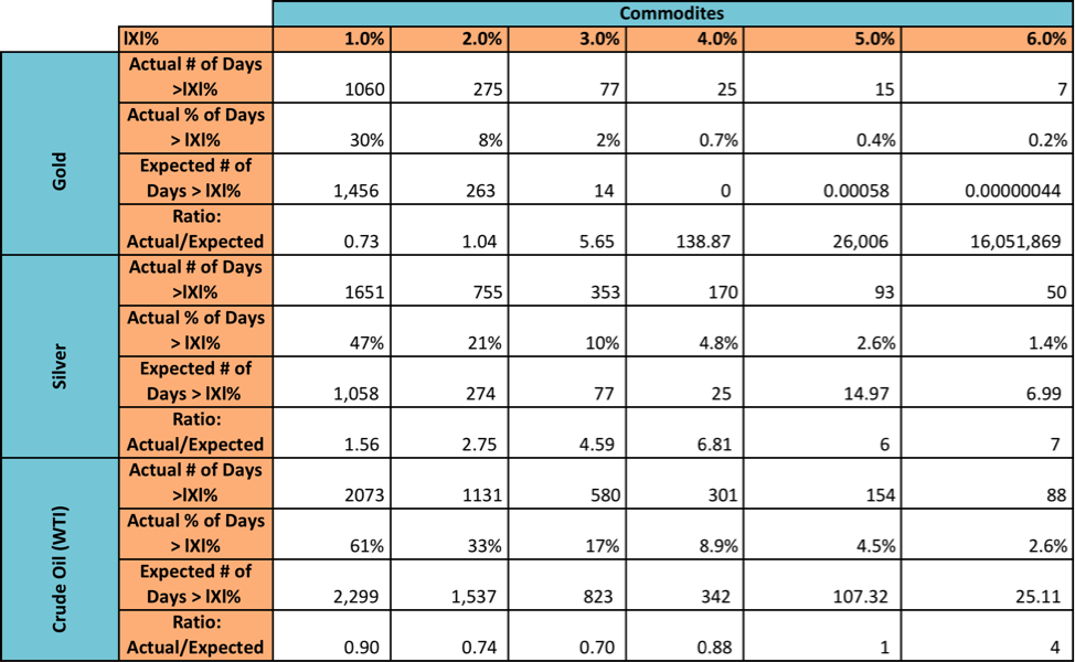
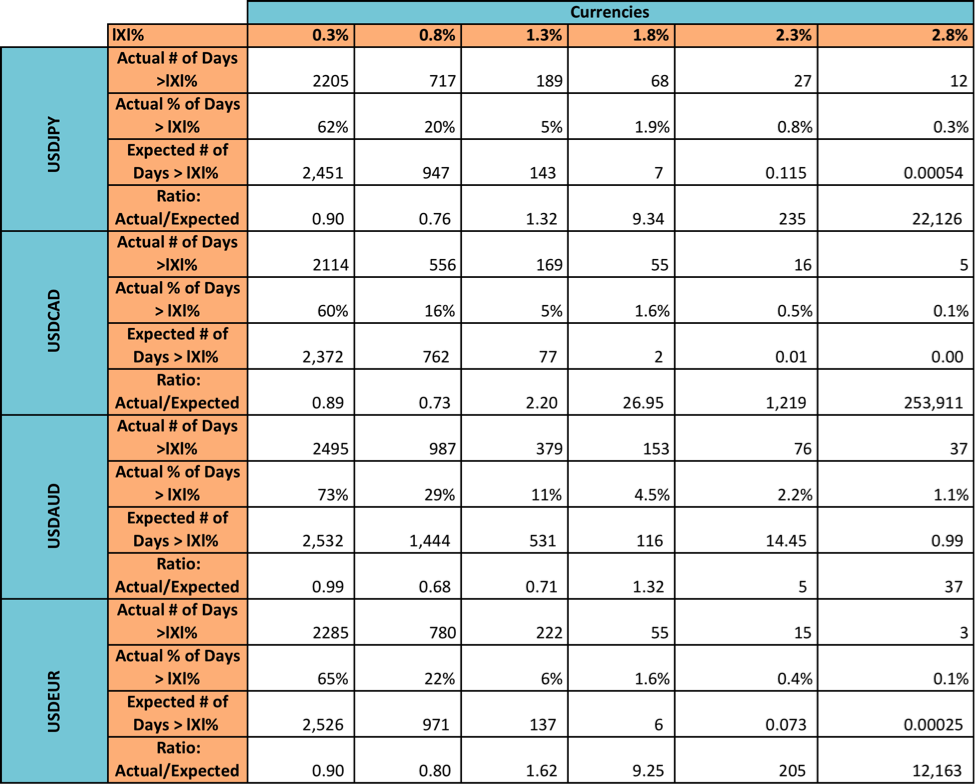
Next, I took the absolute values of the daily percentage returns and set different levels of daily returns and counted how many of the absolute value returns in the data set for each asset exceeded that level (i.e., answering the question, “On how many trading days between January 2000 and today were the magnitudes of the percentage returns greater than X%). I then applied the normal curve to those levels to get an estimate of how many days in the data set one should expect each asset to exceed each return magnitude.
I then took the ratio of days over the time period one should expect to see returns of magnitude X% or larger and compared them to the number of days where returns actually were larger than X%. In other words, a ratio of 17x means that the given return level was exceeded 17x more often than a standard normal curve says it should. A constant ratio of 1x across all return levels indicates a perfect normal distribution.
The results were extremely interesting. For example, between January 3, 2000 and July 16, 2013, the standard normal curve says we should expect return magnitudes of 8% or greater on 8.9 x 10⁻¹⁰ days during the time period for the S&P 500. The actual count was 5 days (making the ratio extremely high). To quote Jeremy Grantham, “VaR fails you exactly when you need it to work the most.” Here is the evidence – Click Charts to Enlarge
Equities
Interest Rates
Commodities
Currencies
Selection of these particular assets was somewhat arbitrary, but my goal was to get more than one in each class. Selection of return hurdles was generally based around actual mean for the low hurdle and around 80% of the actual maximum value for the high hurdle. Normal distribution has been anything but normal.
Thanks for reading.
Twitter: @maxmoore306 and @seeitmarket
Any opinions expressed herein are solely those of the author and do not in any way represent the views or opinions of his employer or any other person or entity.


