On Friday the S&P 500 closed at an all time high while the Volatility Index (VIX) went into the weekend just under 15. While a value of 15 isn’t incredibly low, it is on the lower end of the 3 month range. While everything looks great on the surface, other measures of volatility might be flashing a warning sign.
However, before we head too far down the road of discussing what’s going on with volatility, it’s probably worth having a quick discussion about the different measures of volatility: implied volatility and historical volatility.
Understanding Implied and Historical Volatility:
Implied volatility is the volatility that most traders think about. If you follow the VIX, you’re looking at a measure of the implied volatility of front month options in the S&P 500. Implied volatility is an input in the price of an option, but it also suggests something about what market participants expect about the volatility of the market over the life of the option.
Historical or realized volatility is a measure of what has actually happened in the market rather than an expectation of the future. Most default charts make use of 20 day historical volatility, which gives us an idea of realized volatility over the previous month. Historical volatility annualizes the volatility of the market over some look-back period. Mathematically, historical volatility annualizes the standard deviation of daily returns. What that means is that larger swings in daily returns will tend to increase the standard deviation of the returns and, consequently, historical volatility.
One of the important things to recognize about volatility is that it doesn’t necessarily suggest anything about the direction of price. That being said, most equity index traders expect volatility to be higher in a declining market than in a rising market. When the media talks about the “Fear Index” and how a higher VIX value means that there is a lot of fear, they are suggesting that higher volatility correlates to lower equity prices. As far as CNBC is concerned, there is nothing to worry about on the upside. Media bashing aside, stock markets usually do exhibit greater volatility in bear, rather than bull, markets.
What is the S&P 500 Telling Us?
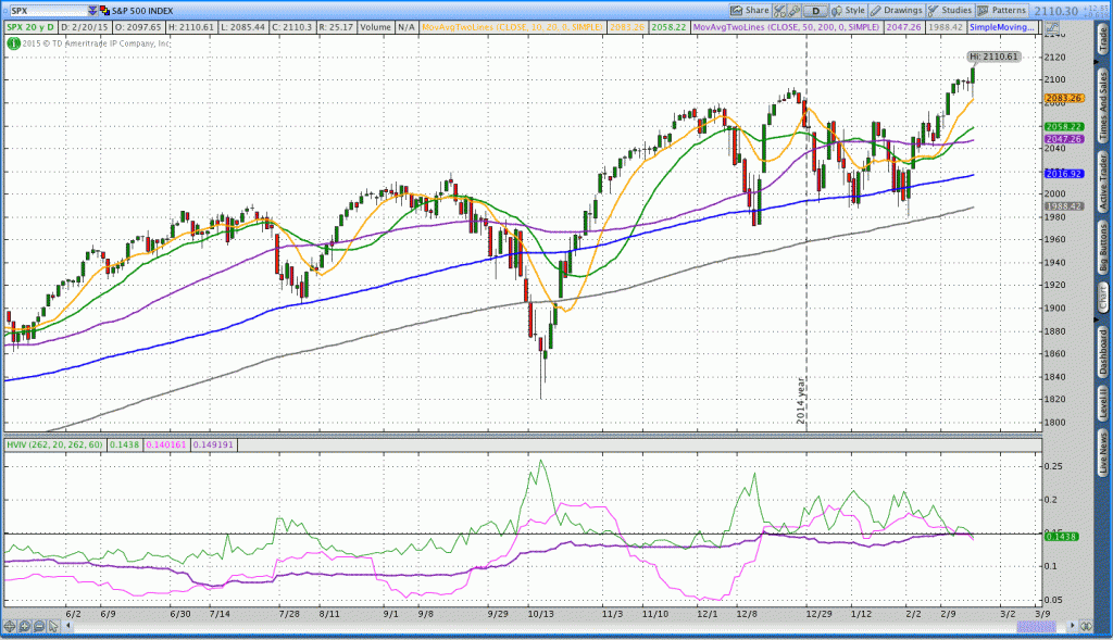
In the daily chart below we’re taking a look at the S&P 500 with different measures of volatility on the bottom. The green line represents implied volatility in the S&P 500. The pink line is the 20 day historical volatility and the darker purple line is the 60 day historical volatility. One of the important things to realize about volatility is that it tends to rise and fall. The rising and falling is why many traders think of volatility as mean reverting. In other words, markets frequently make extreme moves and then settle down or stabilize. Click to enlarge charts.
In order to better understand volatility, we really should consider both the fixed number and the trend of the volatility. In looking at the chart above, notice that the 60 day historical volatility (dark purple line) has been rising since July 2014. Implied volatility (green line) has also exhibited a general upward trend over that period of time. Price is also higher, but it definitely hasn’t been a slow and steady rise.
On Friday when the market closed at a new all time high, 60 day historical volatility also closed at an elevated level of around 14.92%. The horizontal black line in the image above shows that the 60 day historical volatility is higher than anything we’ve seen in a while. In fact, we haven’t seen 60 day historical volatility around 15% for a couple of years.
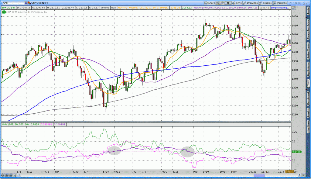
The last time 60 day historical volatility was this high was from June to August 2012:
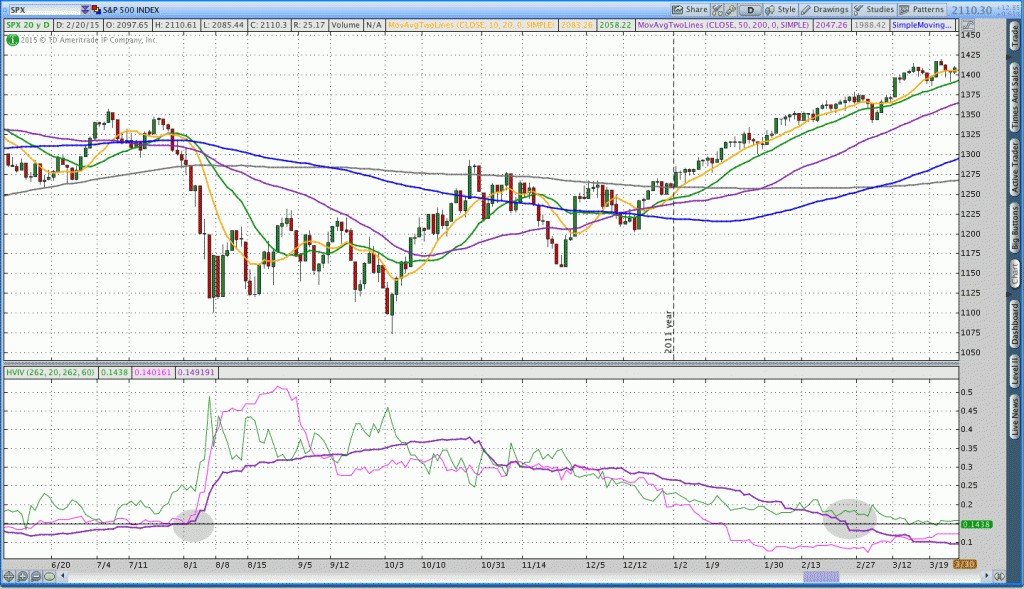
It was also elevated about a year earlier from August 2011 to February 2012:
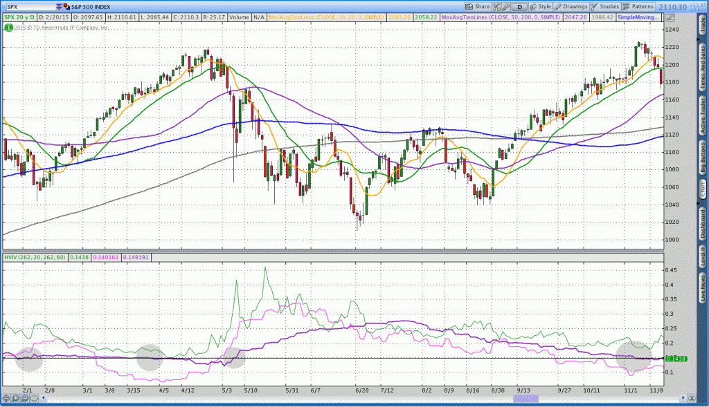
A good portion of 2010 was spent with 60 day historical volatility over 15%:
Going forward:
In all of the images above, 60 day historical volatility rose above 15% after the market declined and tended to decrease as the market stabilized and moved higher. Right now we’re seeing a sideways to higher market with rising historical volatility. Intuitively, that sounds like the market is moving more violently and struggling to move higher. That type of price action suggests either indecision or exhaustion.
What’s going to be important in the coming weeks is both the trend in price and the trend in historical volatility. We’d expect to see historical volatility fall if the market continues higher. However, we’ll want to keep an eye on the downside if both price and historical volatility continue higher.
Volatility is complex and can impact trades in unexpected ways. For more insights on this, check out my recent post on how rising volatility actually helped a short vega options income trade.
Follow Dan on Twitter: @ThetaTrend
Author holds positions in the S&P 500 ETF (SPY), the Russell 2000, and its ETF (IWM) at the time of publication. Any opinions expressed herein are solely those of the author, and do not in any way represent the views or opinions of any other person or entity.


